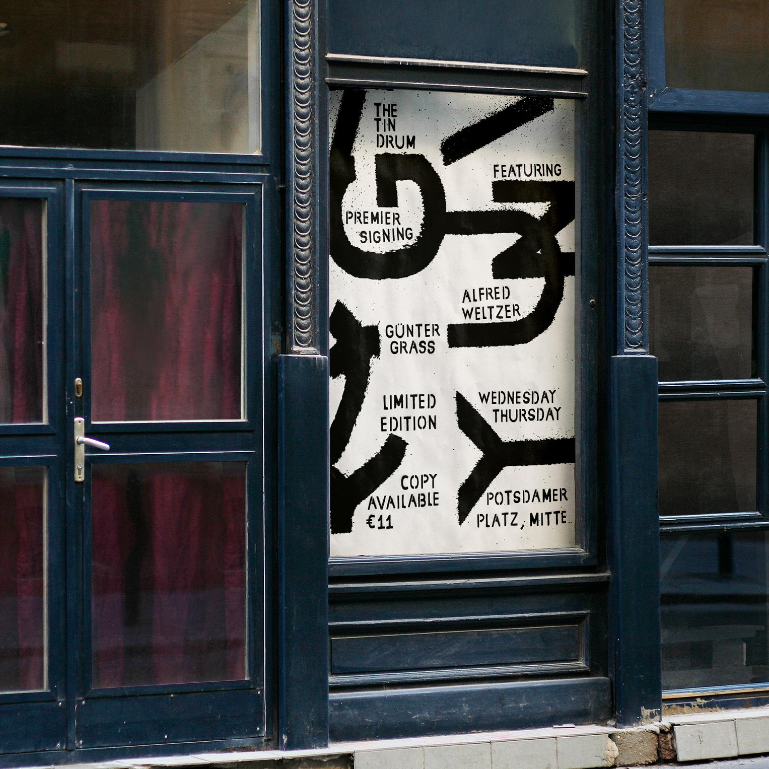
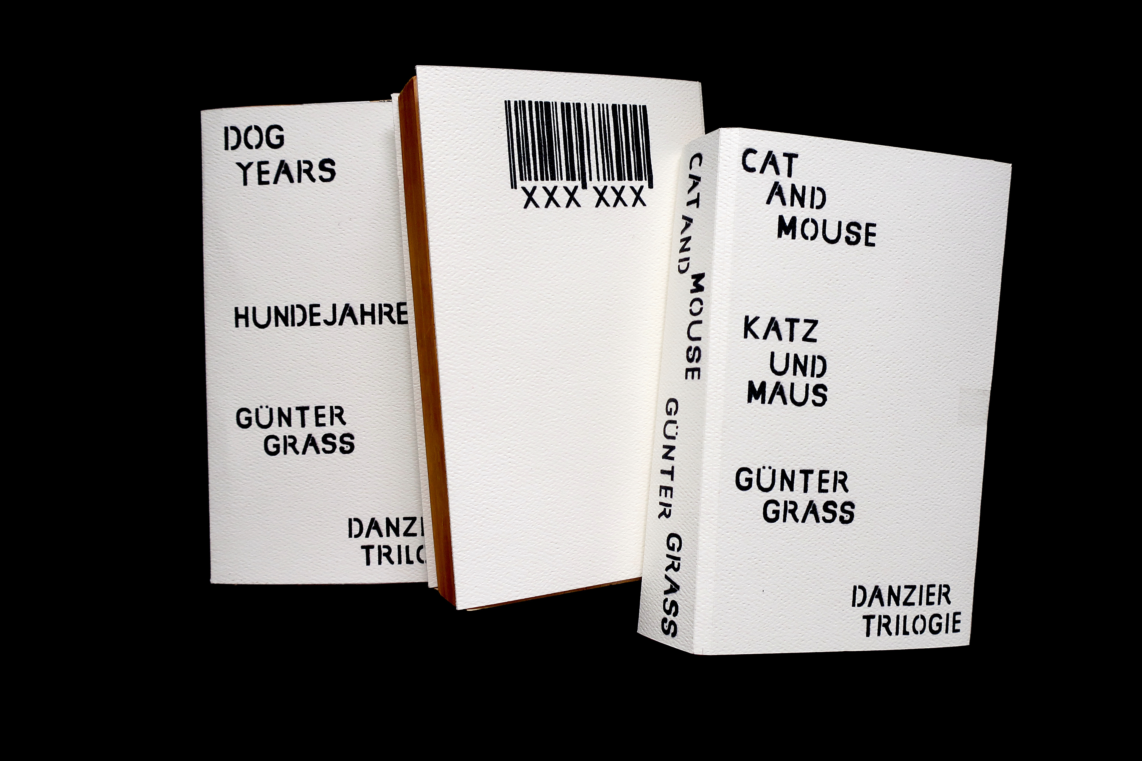
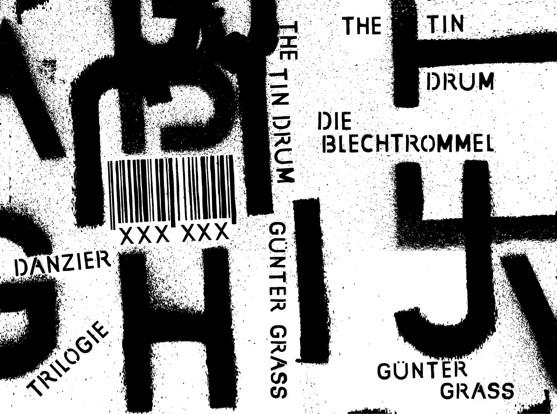
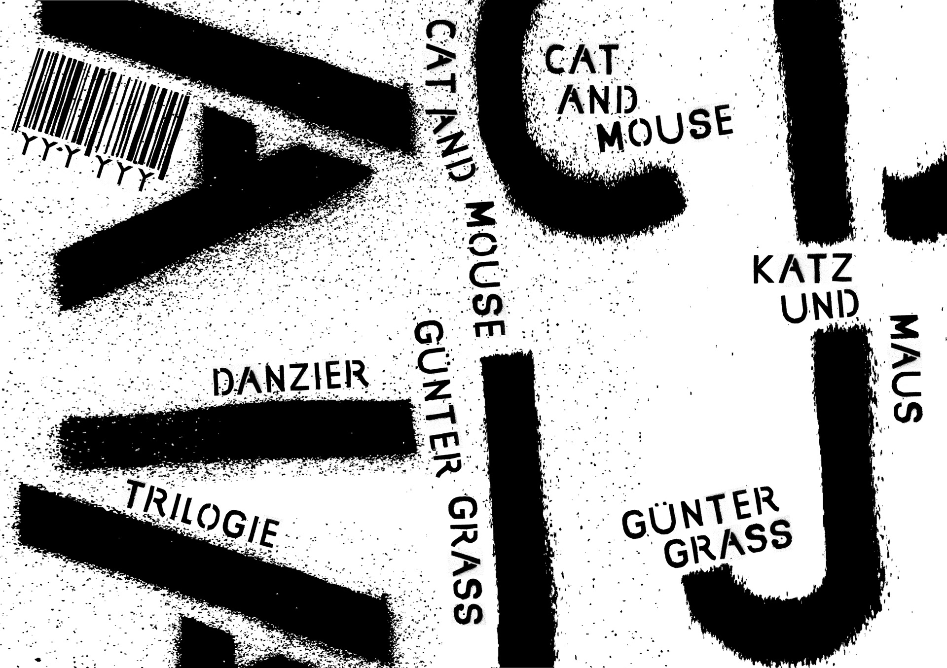
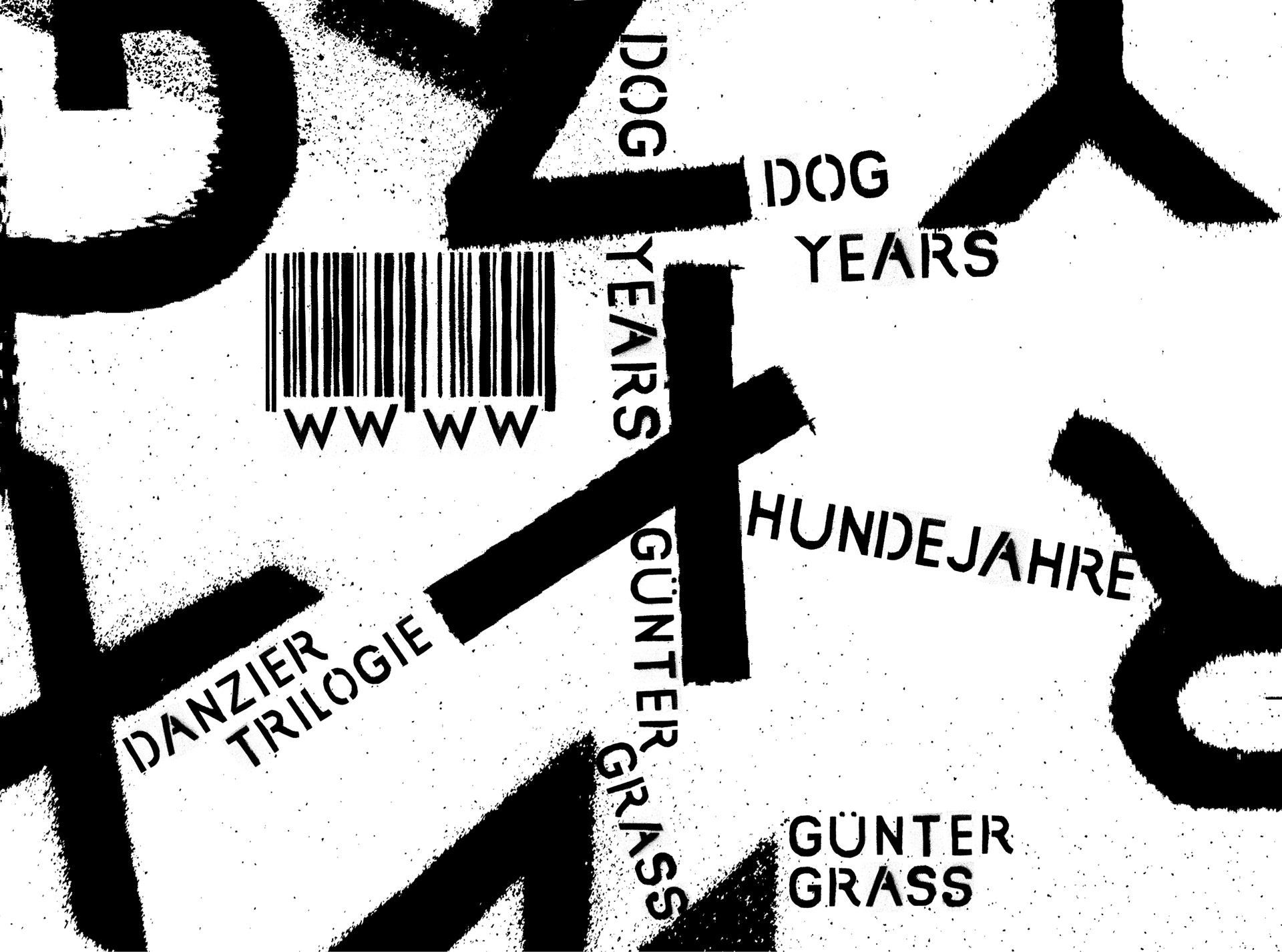
The Tin Drum is the first novel of the Danzier Trilogie by Günter Grass. The books represent the turbulent life of two boys living in Post WWII Europe. Since graffiti has a history in war, especially when it comes to representing the true feelings of people living through it, I thought spray paint would be an appropriate medium to create interesting typography.

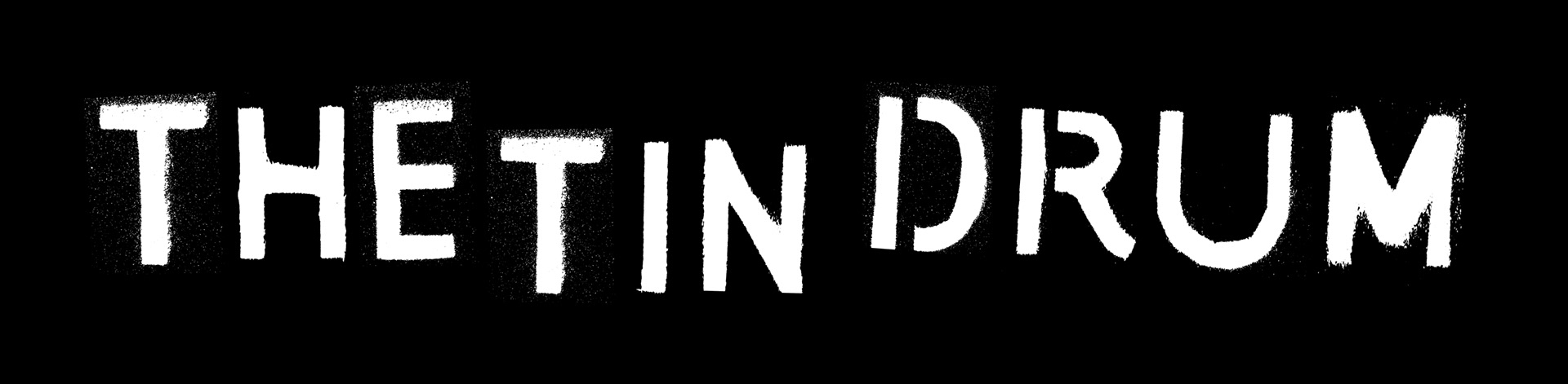
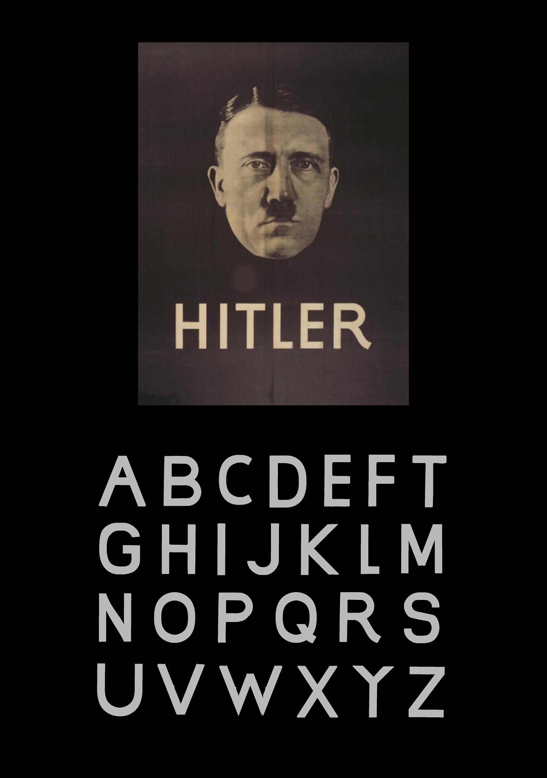
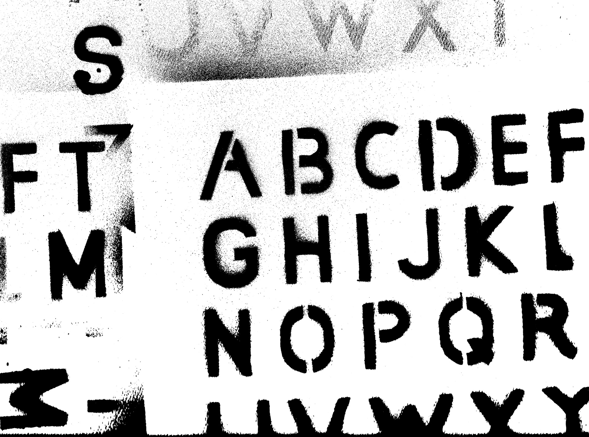
My first task, like with many of my projects, was to create a font. This particular font was inspired by a 1932 Hitler campaign poster I stumbled upon while doing some research.
Recreating the letters from the six I had to work with was a creative and engaging process. Finessing the anchor points was a bit tedious but in the end it was worth it. After the font was complete, I cut the letters into stencils, sprayed them a few times and scanned the results. This is what those scans looked like.
A barcode was also cut and sprayed, as a digital one simply would not match.

I began to create compositions for the book jacket. Using the letters like abstract shapes, I scaled up the gritty letters letting the speckled spray paint create a satisfying visual that suggested the tension existing in the 3 novels.
During our class critique one of our guests inquired as to why I bothered using spray paint when I could have achieved a similar visual digitally. My reply was that the alphabetical scans of my spray painted alphabet actually inspired me to use the type to create these abstract shapes. When I pulled the scan onto my document, It automatically popped it in at a very scaled up and cropped composition and I thought to myself, that looks cool. If I had done the same thing entirely digitally I would not have arrived at the same design conclusion.